3D spatiotemporal mapping of COVID-19 is a new approach to epidemiology developed with the aid of AI, big data, and other digital technologies. Showing on a map the geographical links between infections over time, this technique is easy to understand and indicates the trends that resulted in the waves of COVID-19 infection spreading from large cities to provincial regions, for example. Hopes are also high for the potential offered by a case density forecasting app similar to the rain radars used in weather forecasting.
Special Feature 1 – Is Science Communication Good Enough? The potential of 3D spatiotemporal maps visualizing shifts in infection
text by Takakazu Kawasaki

Tomoki Nakaya
Professor, Graduate School of Environmental Studies, Tohoku University
Professor, Environmental Geography, Graduate School of Environmental Studies, Tohoku University. Also holds concurrent posts in the Graduate School of Science and Faculty of Science. Nakaya specializes in geographic information science and spatial epidemiology. In 1997, he completed the doctoral program in geography at Tokyo Metropolitan University's Graduate School of Science, gaining a Ph.D. in science. Nakaya took up his current post in April 2018, having previously served as assistant professor, associate professor, and professor at Ritsumeikan University College of Letters, visiting researcher at the University of Leeds, Newcastle University, and the University of Sheffield in the UK, and Vice Director of Ritsumeikan University Institute of Disaster Mitigation for Urban Cultural Heritage. He also previously held concurrent posts as visiting professor at University College London.
In early December 2020, just as the third wave of COVID-19 struck, an infection map called the COVID-19 3D spatiotemporal case-density map (hereinafter, the “3D spatiotemporal map”) was published online (https://nakaya-geolab.com/covid19-stkd/japan/). It was developed by Professor Tomoki Nakaya of the Graduate School of Environmental Studies at Tohoku University, along with Tohoku University graduate student Shohei Nagata and a team from Tokyo-based company JX Press Corporation.
The principal feature of the 3D spatiotemporal map is that the state of COVID-19 outbreaks is visualized on the map along with the passage of time, providing a chronological picture of the progress of the epidemic across the country. Creating an effect that resembles a mille-feuille cake, each day’s infection map is layered over the previous one like pastry.
Facilities with outbreaks look like clouds
A facility where infection has occurred appears on the map like a faint cloud. The more facilities where infections have occurred, the darker the cloud for that particular district becomes, eventually changing color. The frequency of infections determines the color, with a gray cloud indicating an infection at one facility in four days, a blue one indicating infections at one or more facilities every day, and a red one indicating infections at five or more facilities every day (Figure 1).
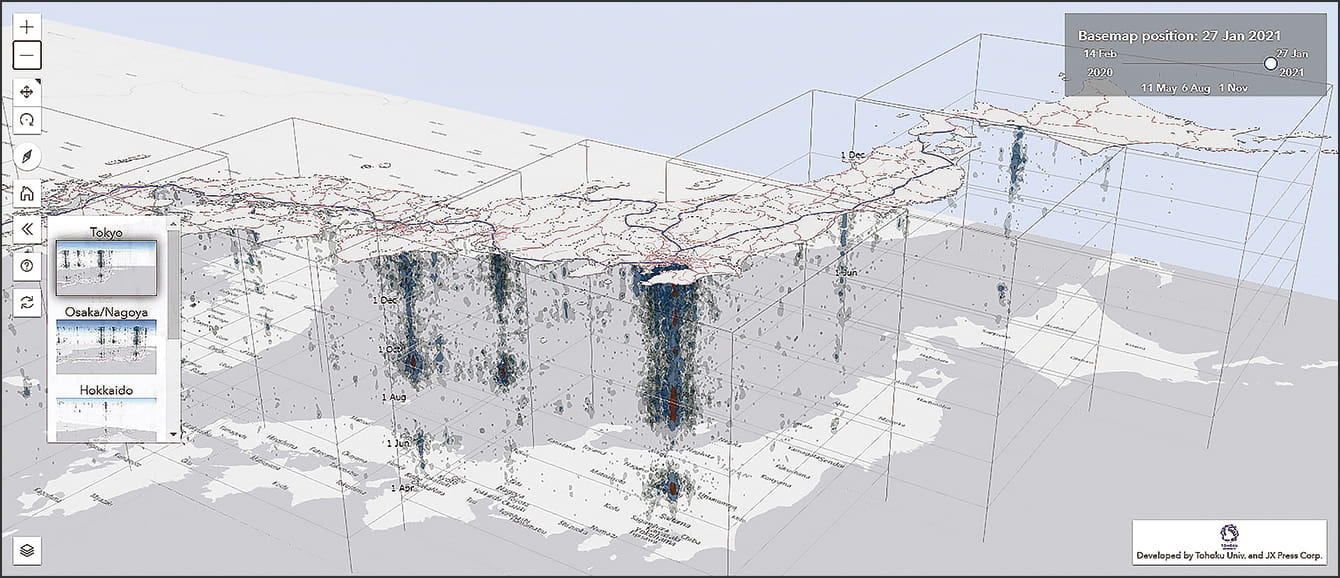
Information about the state of outbreaks in various facilities has been updated on the COVID-19 3D spatiotemporal map almost every day since February 2020. The slider is used to show the state of outbreaks on a specific date.
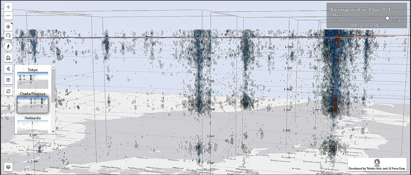
From the side, display showing the state of outbreaks in each region looks like clouds. One can also see the connections between Tokyo (dense cloud) and other regions.
Figure 1. State of outbreaks as seen using the COVID-19 3D spatiotemporal map
The time axis runs from mid-February 2020, about a month after Japan’s first cases were confirmed right through to the present day, with the map updated almost daily. As the daily outbreak status is overlaid along the vertical axis (time axis), districts where outbreaks of infection are continuing appear to have a cloud rising over them. Moving the date slider enables the status of an outbreak to be displayed on a specific date.
Helical CT scanners are used for medical imaging. These take X-ray images of the body in a spiral, so that sliding the images of the sections (tomogram) causes the shapes of the organs and blood vessels to become visible, as though one could see through the body in 3D. This makes it easier to spot any displaced areas or lesions.
Similarly, viewing the vertical axis (time axis) of the 3D spatiotemporal map from the side causes the clouds to grow larger in areas where the infection spread rapidly and one can see the clouds changing from gray to blue to red. Conversely, when people started to refrain from nonessential, nonurgent outings under the state of emergency, the infection clouds gradually withered after a week or two.
“The interval between onset dates when an infected person produces a new infected person is believed to be around four to five days,” Nakaya explains.
“Consequently, even a gray cloud growing upward on the 3D spatiotemporal map suggests the possibility that infection is spreading within that area. Where the 3D spatiotemporal map differs from conventional two-dimensional infection maps is that it enables us to observe the links of infections within a region.”
Infections considered spreading to other areas from Tokyo
Looking at the state of outbreaks over time, we can compare outbreaks in different cities and infer the possibility that an outbreak might have spread from one location to another.
“While some people might find it easier to understand single-day infection maps and animations, it’s very important to understand the temporal and spatial characteristics simultaneously when looking at the spread of COVID-19 infection,” Nakaya says, explaining the advantages of the 3D spatiotemporal map.
“For example,” he continues, “if we look at the 3D spatiotemporal map from the side, we can clearly see that during the growing outbreak called the second wave, a rise in cases in Tokyo was followed a little later by outbreaks in Nagoya, Osaka, and Kyushu. This suggests the possibility that the infection spread to those other areas from Tokyo. Genome analysis supported that the virus from the June Tokyo clusters subsequently spread to other cities,” he says.
The finest detail of data Nakaya chose in 3D spatiotemporal map is the address of the facility where the COVID-19 outbreak occurred. However, media reports are mostly limited to figures for the number of patients by prefecture, a coarse regional unit. Even where case numbers are published by each local government, the geographical units and information formats all differ, and detailed data is not published in most cases. How does the 3D spatiotemporal map collate all this data?
“In Japan, information about patients who have returned positive PCR tests is registered in a central government-managed information system,” Nakaya says. “However, the system does not allow the more detailed data on infections to be publicized regularly on a sub-prefectural level such as public health centers.”
“Accordingly,” he continues, “we approached JX Press, which gathers and disseminates information about disasters, accidents, incidents, and COVID-19 cases both within Japan and overseas, and they agreed to provide us with big data on the reports of individual infections. When cases were identified, people operating companies and facilities such as restaurants, medical institutions, and educational institutions put out information such as ‘We are temporarily closed due to a case having been identified,’ in order to prevent the spread of infection. JX Press staff gather such information around the clock with the aid of artificial intelligence (AI), use it to identify the business type and address, and then process it into data and publicize it as the 3D spatiotemporal map. While our map is not based on official data, it provides a more detailed picture of the geographic status of outbreaks.”
JX Press disseminates information to companies, public organizations, and the media, and also conducts opinion polls using automated telephone systems. As well as releasing information to major digital media, it has a solid record of achievement in working with universities and research institutions on initiatives relating to the use of information for disaster risk reduction, so it would be fair to say that its data is trustworthy.
Creating a spatiotemporal map for the Great East Japan Earthquake
Asked how 3D spatiotemporal maps can achieve effects in terms of preventing the spread of infection, Nakaya replies, “I’d like to see experts responsible for measures to combat infection looking at the 3D spatiotemporal map in conjunction with data on PCR testing results and using it as a basis for making decisions on measures while thinking about the status of outbreaks. This could include considering the extent to which stores should restrict their operation and the areas where people should refrain from going out.”
“For example,” he explains, “if there are outbreaks at five or more facilities every day within a certain area near central Tokyo, that means there is a high probability of infection if people go there, because it’s a place where infections either are occurring or have occurred. This would suggest that people in that area need to avoid moving around, as far as possible, in order to contain the infection in that district. It might also be advisable to increase PCR-testing sites on the streets and to consider prioritizing that area for vaccinations at an early stage, once it becomes possible,” he says.
This is not the first time that Nakaya has developed a 3D spatiotemporal map that combines a map with time. During his time at Tokyo Metropolitan University, he studied at the Department of Geography in the Faculty of Science, and when he was an associate professor (and subsequently professor) at Ritsumeikan University, he applied the same time geography techniques to create a spatiotemporal earthquake map for the Great East Japan Earthquake (quake3D).
“Based on data from the U.S. Geological Survey, we identified some deeply interesting findings from an analysis of the hypocenters and scales of earthquakes occurring around the time of the Great East Japan Earthquake, using techniques similar to a spatiotemporal map,” Nakaya says. “A magnitude 9.0 earthquake —— Japan’s largest —— struck on March 11, 2011. In the 3D map we created, you can see a cluster of aftershocks in the wake of the Great East Japan Earthquake across a wide area offshore from the Tohoku region. These triggered separate earthquakes around the same time in Yamanashi and Niigata prefectures, which appear like a linked cloud rising upward on the 3D spatiotemporal map. Following the occurrence of the quakes over time on the map provides a visual indication of the synchronization of clusters of earthquakes in separate areas, which had not previously been understood.” (Figure 2)
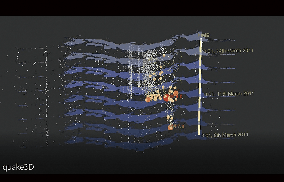
Figure 2. Spatiotemporal map of earthquakes around the time of the Great East Japan EarthquakeTwo days before the main quake (M9.0, indicated by the red circle), there was an M7.3 earthquake near the hypocenter. In addition, the main quake was followed soon after by earthquakes in Yamanashi and Niigata Prefectures.
While researchers expressed concerns that 3D maps such as this spatiotemporal earthquake map might be hard for the public to understand, the response from undergraduate students was positive. He says this is part of the reason why he decided to publicize the current 3D spatiotemporal map online, as he is keen for the public to see and understand it.
Nakaya has also applied time geographical techniques to research aimed at preventing sexual offenses, which was published as “The Spatiotemporal Concentration of Rape and Indecent Assault Cases Identified in Kyoto City and Near Repeat Victimization ” in the report by the Subcommittee on Countermeasures against Sexual Crimes, Kyoto Prefectural Police Research Committee on Crime Prevention Measures (Kyoto Prefectural Police) and as “Crime Prevention Based on the Concept of Preventive Medicine” in “Recommendations of the Tokyo Metropolitan Police Department Expert Panel on Safety Measures for Children and Women” (Tokyo Metropolitan Police Department).
In his research on sexual offenses in Kyoto City, Nakaya points out trends and countermeasures. To give just one example, many of the cases involving a victim aged under 16 occurred within children’s local neighborhood around their home and school, with a peak in the early evening as they return home from school (Figure 3).
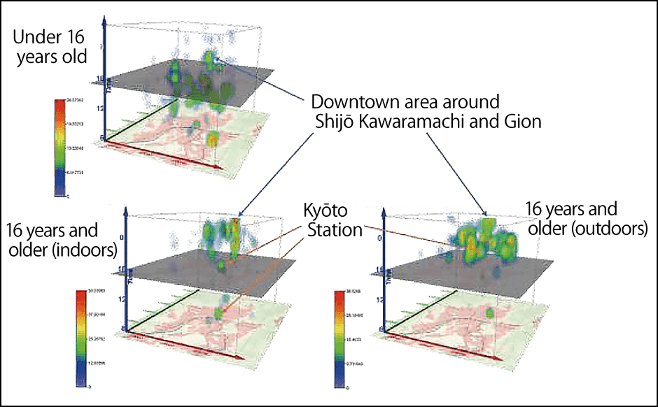
Figure 3. Spatiotemporal map of sexual offenses in Kyoto CityWhere the victims were aged under 16, most assaults occurred within the neighborhood where the children lived and went to school, peaking in the early evening. Cases involving victims aged 16 or over occurred continuously in the city center and at Kyoto Station.
(Source: Report of the Subcommittee on Countermeasures against Sexual Crimes, Kyoto Prefectural Police Research Committee on Crime Prevention Measures, August 2015)
However, in the downtown area of the city center there are many cases later in the night. In addition, there is a strong tendency for repeat assaults to be concentrated within a specific district within a comparatively short time frame. He suggests that countermeasures against this tendency could include organizing neighborhood patrols focused on the time periods when particular caution is required, and also stepping up crime prevention measures once a crime has been identified, as a precaution against further offenses likely to occur in the vicinity soon after.
In the case of sexual offenses in Tokyo, he pointed out that offenses begin to occur in Shinjuku in the evening, with the area within which offenses occur spreading throughout the 23 special wards from late at night until early dawn. He also used a spatiotemporal map to bring to light the fact that sexual offenses frequently occurred at railway stations near urban districts on the outskirts of Tokyo after midnight (Figure 4).
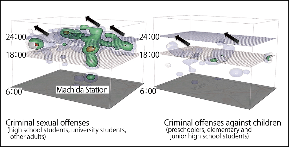
Figure 4. Spatiotemporal map of crimes within the district of Machida Police Station in TokyoAfter midnight, the incidence of sexual offenses slides upward at Machida Station and surrounding stations. The scenes of crimes correspond with the movements of people heading from stations to residential areas in the hills.
(Source: Recommendations of the Tokyo Metropolitan Police Department Expert Panel on Safety Measures for Children and Women, September 2017)
“There are many residential areas in the hills some way from the stations in these districts,” he explains. “This would appear to indicate that women are coming to harm while walking home from stations late at night. Researchers from the National Research Institute of Police Science who considered the issue also pointed out a link between crime and the movement of people after victims exit stations.”
“If sexual offenses are related to risks arising from women walking home late at night, it might be advisable to consider measures to alter the environment. These could include increasing streetlights, operating late-night buses, local governments providing a subsidy to fund a ‘late-night discount taxi’ system in place of the existing late-night surcharge system, and installing telephones in stations with a direct line to taxi services,” Nakaya suggests.
Forecasting case density like a rain radar
The development of this recent 3D spatiotemporal map brought to light the extent of COVID-19’s spread and the fact that infections were spreading from large cities to provincial and peripheral cities via modes of transport.
“Looking at the state of outbreaks at a certain point, one can, to some extent, predict from that information the areas to which there is a probability of infection spreading within a short time,” Nakaya says. “There is a possibility that we might be able to put out a case density forecasting app to provide warnings, like the rain radars used on smartphone weather forecast apps.”
“It would warn people in areas of concern to avoid nonessential, nonurgent outings,” he continues. “I want people to look at the 3D spatiotemporal map and think about the fact that providing information to understand the current state of outbreaks is effective in preventing and minimizing COVID-19 infections.”
(Figures courtesy of Tomoki Nakaya)